Showing posts with label #MyHouseMonday. Show all posts

Monday, May 20, 2013

My House Monday: Letting My Little Light Shine

I made it...just barely...in time for #MyHouseMonday, a totally self-imposed deadline for at least one weekly project.  I am ashamed to say, I have pushed the deadline with only 2 hours to spare (we started at 8ish)!  This week's (and a bit of the last few weeks') dilemma has been deciding which light fixture to hang above the kitchen table.  Okay, that sounds ReALly shallow and in truth, that hasn't been the only dilemma at the house.  We have had a rough couple of weeks around here, but working on the house has proved to be a nice escape.  In fact, I got up extra early this Monday morning before reporting to work at 7:30am just so I could swing by Home Depot.  (I can't seem to help myself!  I love that store.)  Back to the lighting...
I thought I wanted rustic.  Definitely cottage.  Hinting at coastal.  I looked high and low.  And I actually purchased three different lights.  Then...I went with something totally different.  
Shiny? Yes!  Sparkly?  Of course!  I feel a bit like Dori in Finding Nemo.  It is so freshly hung that it doesn't even have all of its bulbs yet.  But I love it!
It is coming together.  Slowly, but surely, I am making progress.
Somewhere along the way I have moved a bit away from the inspiration picture and started just filling it with stuff that inspires me. (Lots of dishes!)
I am mixing it all together to create a room I want to be in and since I am hanging out in the kitchen more, I find myself cooking more...much to Mike's delight:)
Okay, I now realize I could center the rosemary and pick up my keys before snapping a picture next time, 
but other than that, I think I am almost done with this end of the kitchen!

Sunday, May 12, 2013

Old Door to Nearly New Headboard

Inspired by the many images on Pinterest and the web for re-purposed doors, I started a transformation of my own this weekend in our master bedroom.  We have a shed full of wood, windows, and doors that we managed to salvage from a late 1800s house earlier this Spring.  Mixed in the pile was a gorgeous chippy blue beauty that was rescued with love during the plunder.  As soon as I saw the it that day, I knew if I got nothing else, I had to have THAT door.  It was one of those gently worn items that beckoned to me despite its battered appearance.  I loved the color and the character and knew I wanted to use it in my home.
  I wasn't exactly sure what I wanted to do with it until this weekend.  I kept thinking that I needed to turn the door sideways to create a traditional headboard, but I didn't want the door to lose its charm by hiding it behind tons of pillows.  After seeing a picture of doors that were turned upright behind a bed, I fell in love!!!
I grabbed the sander and got to work.
I tried sanding the door down to its natural wood finish (like in the inspiration pictures) and it lost all of its appeal to me.  The doors in the inspiration pictures had elaborate moldings...this one, not so much.
Previously home-made headboard getting the boot.
So, I flipped it over and tried again.  I gave it a quick once over with the sander 
to remove the loose paint and grime and brought it inside.  
I hung a piece of ironwork on the door and centered it up between the windows.
I left the old hardware attached and just wiped the metal down to remove the dust.
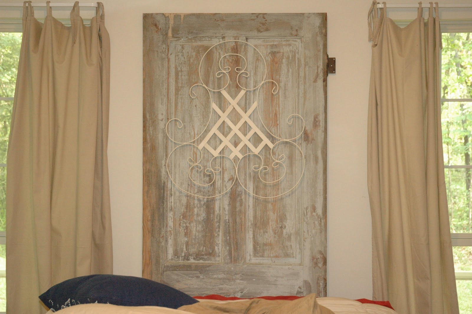
Disclaimer (in case my mom is reading this):  The bed really was made.  I moved the pillows to shove the door in place:)
All of the pictures I saw had two doors placed side by side to run the width of the bed, in fact, that was what made the pictures so attractive, but my room is full of windows and two doors would be one too many.  I was so disappointed when I realized the single door looked too skinny for the wall!  It definitely needed something else to help fill the space out.
I decided on brushed nickel wall sconces.  They plug directly into the wall so, no special wiring was required...yay!  
While there is still more to do (isn't there always???), I am liking it so far.

Monday, May 6, 2013

No More Naked Windows

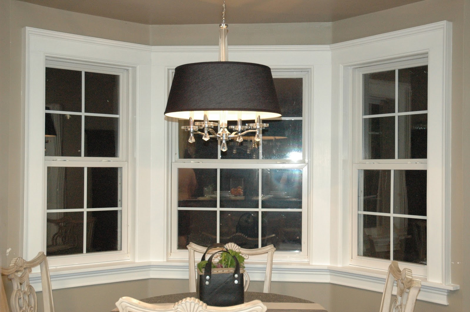
After 13 years, my windows are naked no more!  My wonderful, talented father-in-law finished them off this week.  Let me back up a bit... Mike and I have been working on the kitchen for the last month or so.  We have updated countertops, installed a backsplash, and added a few accessories.  After pouring over tons of blogs and looking at numerous homes on Houzz, our heads were swimming with possibilities. In fact one Friday night, we spent an hour sitting at the kitchen table just staring at the walls.  "Should we install board and batten?  How would we do it?  It is adorable, but will it stand the test of time or seem dated 10 years from now???"  After much deliberation, we are no closer to a decision on the b&b for the kitchen walls, but we decided to go ahead and add trim to the bay windows.
They were so bare.  When we first moved in, I hung valences, but removed them when I repainted the walls.  I liked the unobstructed view to the lake, so I decided to leave them off.  I am ashamed to admit, we had never even painted inside the sashes and over time the sheet rock began to crumble.  Looking at the picture here, I think it seems so unfinished.  After googling scads of pictures, I decided that I wanted to treat the windows as one unit. Treating the three windows as one seemed to make more of a statement than trimming each window separately   Since we still don't know about the rest of the wall, I figured this might be it and I had better make the trim hefty.
My father-in-law spent about a day and a half working on them.  He trimmed inside each window frame with 1/4" birch plywood  
and then made trim pieces with a router bit (Roman Ogee curve). 
The trim pieces covered up the rough edges of the plywood and butted up to 1"x6" used to fill in between the windows.
He turned a small piece of wood sideways to make a right angle with the 1"x6" boards and then staggered two layers of the molding on the edges.  It made the window look much bigger.
After puttying, caulking, and painting, I think it looks great!  I am loving My House this Monday!  
 Now, only about a gazillion more projects before we finish the kitchen:)  What do you think, should we add board and batten to this wall?  Can you do just one wall or do you have to do the whole room?  Comments and ideas are appreciated!

Monday, March 25, 2013

Which Backsplash...aaaggghhh???

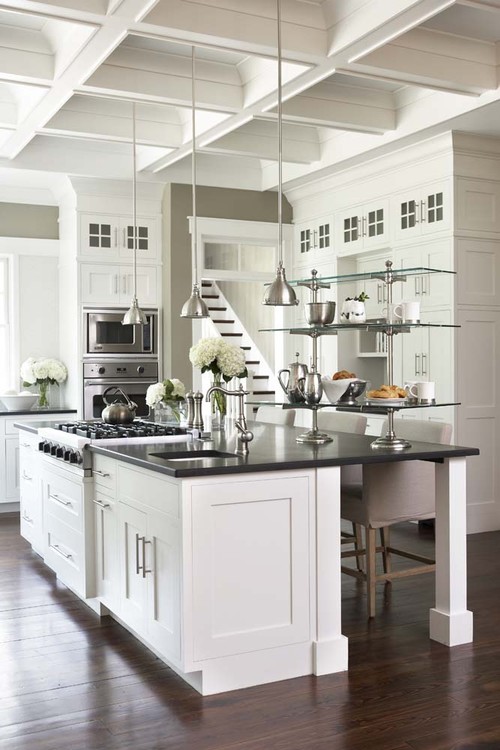
    I think I have spent more time in my kitchen these past few weeks than ever before.  I have painted cabinets (well the lower section, at least...I still have the upper ones to tackle), ripped out laminate and installed granite, and now, picked the backsplash.  Selecting the backsplash was trickier than expected.  I struggled in choosing between the inspiration room's subway mosaic and a beautiful natural stone found at Lowes.  
Image from FastFloors
     The designer of the inspiration room had installed Crossville Tile's 1x2 Savoy series glossy white.  The closest Crossville distributor was actually 3 hours away.  I made a quick call to the rep and he generously sent a sample which arrived within 3 days.  I was beyond thrilled when the UPS man delivered my sample.  Unfortunately, when we held it on the wall, we didn't loooovvvve it (and after waiting 13 years to "do the kitchen", I thought we should).  The tile was beautiful and it looked fabulous in the pics, but on our long run of cabinets (12 1/2 feet) and the 1x2 pattern looked waaaaaayyyyy too busy.  
Image from Lowes
     I headed to Home Depot and Lowes to find an alternative.  Lowes had a soft white natural stone with gray striations which was beautiful! I brought home two boxes and we all agreed - it was the one.  It wasn't the bright white of the room, but it was gorgeous.  After agonizing over the choice for days ( I polled friends, family, and even my students), we chose the natural stone.  Unfortunately, it was gorgeous only in small batches! When we laid it out prior to installation, we realized it didn't work.  Some stones featured gray, but most were white with brown spots!  I hate brown spots!!! Aaaaggghhh!  I had bought 28 boxes from 2 different locations (2 different lots/runs + natural stone = major variations!!!)  I couldn't put the brown spotted tiles back in their boxes fast enough.  
     Mike and I loaded up the stone and headed back to the store.  Now, what?  I had liked everything about the inspiration room.
Image from A Postcard from Paris
I wanted to recreate the feel without  using the tiny mosaic. 
Image from A Postcard from Paris
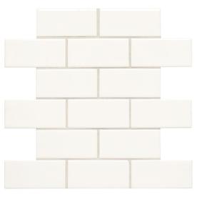
I looked through other kitchen pics I had collected on my iPad and phone over the past few months. They all had a high contrast between the backsplash and countertops.  They tended to be bright and white.  Many had a subway tile backsplash.  I like traditional subway tile, but I liked the smaller tiles from the inspiration house too.  I went back to the tile section of my big box stores and found this:
a 2x4 glossy white mosaic, my new backsplash!
So much effort...and we still have to install it :)

Monday, March 4, 2013

Adding Molding, Adding Height

In last week's #MyHouseMonday's post, I shared pictures of the house which inspired our paint choice.  While visiting the house, I was a bit envious of the extremely tall ceilings.  The rooms felt so big and roomy that I found myself feeling downright tiny.  There were so many things I loved about the house that I knew I wanted Mike to visit the house with me,  so that we could figure out which features we could copy:)  After hearing me rave about the ceiling height for 30 minutes on the drive over, we walk into the space and Mike looks at me and says, "These ceilings are the same height as ours."  "No, it can't be.  I don't feel short in our rooms.  What is the difference?"  The transom windows!
The architectural detail automatically draws the eye upward and accentuates the vertical height.  

Image from Houzz
                                               It's true, look at how tall this room seems!
Image from Design Chic
Ok, so while I love the light airy feeling created by the transom windows, I mainly liked the feeling of height.  Since it was not financially practical to add the transoms to the cased openings in our living room, we came up with an alternative...molding.
 Just look at how short the doorway looks.  Until...we added molding:)
 We did 5 openings in all.  Each span was about 4 feet wide.  The whole project cost a bit less than $100 (much cheaper and more practical than adding transom windows).
 This project was simple, inexpensive, and gave the same feeling of extra height...perfect!!!

Monday, February 25, 2013

Grab the Paintbrush: It's Time for a Change

After 13 years, two boys, a dog, numerous cats, three bunnies, and one tiny gerbil who was more of an escape artist than a pet, it is time to update the house.  She is showing more wear than shine.  Scuff marks adorn our once white doors and finger prints serve as proof that children once ran laughing and squealing through this place in the swamp.  We have started out slow and easy, choosing projects that make a noticeable difference, but cost more in effort than cash.  First up for #MyHouseMonday...paint!  Inspired by this house featured in our area's Builders' Parade of Homes,

we choose a soft neutral which reminded me of beach sand.  
Not that I am usually inspired by dirt, but the thoughts of waves lapping over the sands of the Gulf shores
as I sat on this front porch was particularly tempting. 


The color in the inspiration home: Benjamin Moore's HC-172, Revere Pewter
      and I figured, if it could make my house look like this...
I had better rush right out to get it!!!


In one weekend, we managed to transform the living room and foyer
with just a couple of paint rollers and a gallon of paint!
For such a small investment, we got really big results.
Love it:)